In This Route Design Log
Why Road Alignment Matters More Than It First Appears
In a tower defense game, the road is not background decoration. It is the player's strategic contract with the map. The road tells the player where enemies will travel, which spaces are dangerous, which build pads are valuable, and where a tower's range will matter. When the visible road and the actual enemy path do not match, the player starts making decisions from false information. The result is not just visual awkwardness. It directly harms game readability.
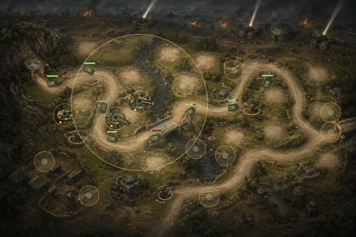
This was one of the biggest early problems in Allied Frontline Defense. The battlefield art showed a winding dirt road, a bunker exit, a bridge crossing, and several obvious bends. The enemies moved along a route that was mathematically valid, but it did not always sit on the painted road. In screenshots, the difference became obvious: vehicles cut across grass, infantry appeared near the edge of the road, and the bridge segment did not land cleanly on the bridge deck. A human player notices those problems immediately, even if the movement code is technically working.
The first temptation with this kind of issue is to call it a small coordinate bug. Move the route ten pixels, reload, and move on. That did help in some places, but it did not solve the larger problem. The route was wrong because two sources of truth were fighting each other. The map image contained one implied path. The movement data contained another path. The translucent guide line was supposed to make things clearer, but when it did not match the painted road, it made the mismatch easier to see.
The real lesson was that route design has to be authored with the same care as enemy stats or tower range. A tower defense route has shape, width, pacing, occlusion, choke points, build pad relationships, and visual anchors. If it is treated as a quick polyline, it will probably betray the map somewhere. The more cinematic the background art becomes, the more damaging that betrayal feels, because the player naturally expects the art to mean something.
The First Fixes: Entrance, Lane Spread, and Route Offsets
The first visible mismatch happened at the entrance. Enemies needed to emerge from the left-side bunker, but the initial movement line felt like it came from the wrong edge. That made the opening seconds of every wave feel broken. The entrance is especially important because it is the first confirmation that the battlefield is honest. If enemies appear beside the road before the player has even started evaluating strategy, the map loses credibility immediately.
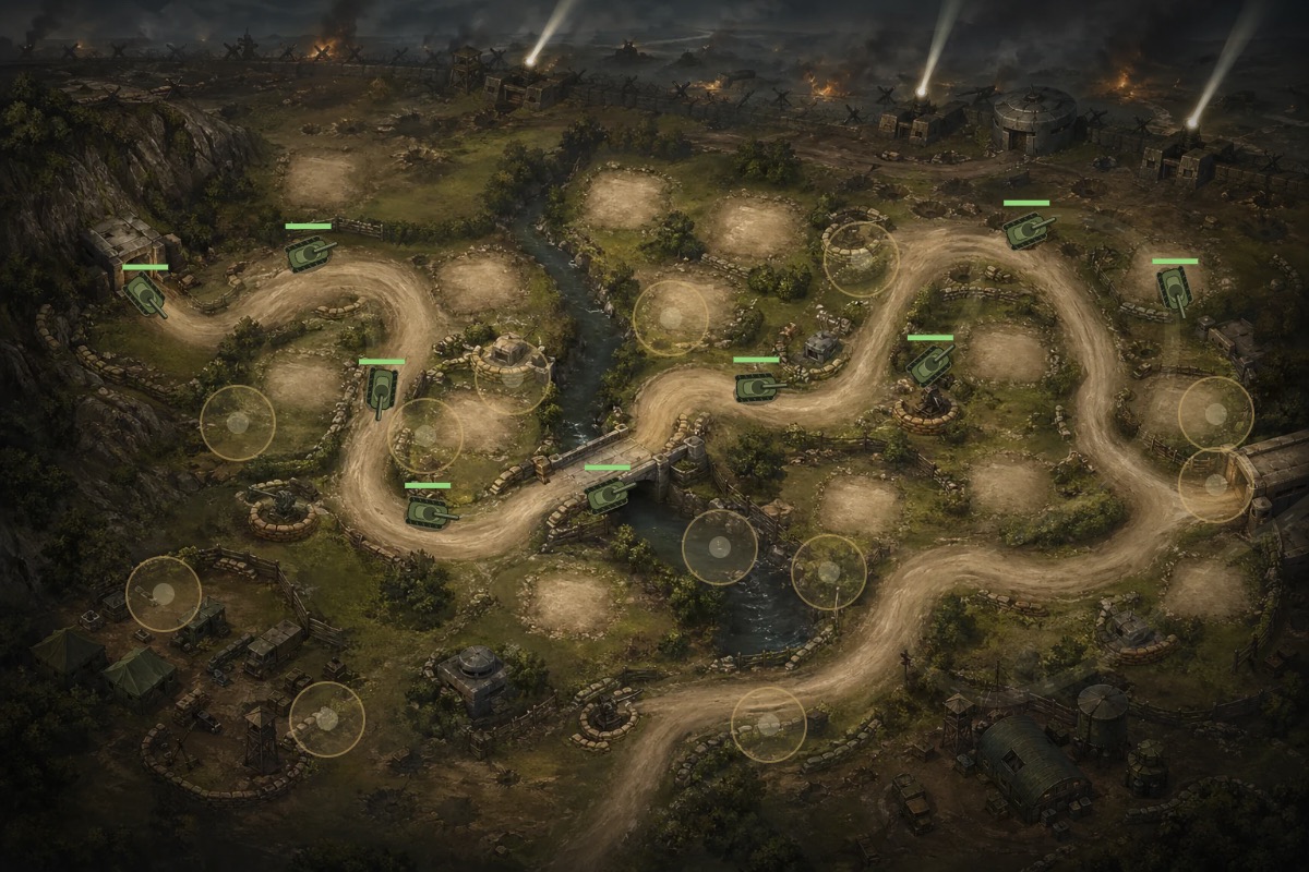
The initial correction moved the path start toward the bunker doorway and retraced the first curve along the visible dirt road. This helped, but it exposed another issue: enemy sprites had their own visual footprint. A tank or truck is not a mathematical point. It has a body, a base, a hit area, and an anchor. Even when the route coordinate was near the road center, the vehicle could still appear to drift if the sprite was anchored in the wrong place. The fix had to include both movement coordinates and visual grounding.
Lane spread also mattered. A little spread prevents enemies from stacking into a single unreadable pile, but too much spread pushes units off narrow roads. The bunker entrance and bridge were narrow enough that the spread had to be tightened. Infantry could still feel like a squad, but the group could not become wider than the road itself. Vehicles needed even more discipline because a tank half on grass looks more wrong than a soldier slightly offset from the center.
After the entrance pass, the route still felt too low in several areas. A shared upward offset was applied so movement, route guide, targeting, and tower default aiming stayed aligned together. This is an important detail: moving only the enemies would have created new problems. Projectiles might target the old coordinate. The guide might show the old route. Tower default rotation might face the wrong point. A route adjustment has to move every gameplay system that depends on that route.
Build Pad Clearance: The Road Cannot Also Be a Tower Slot
Once the ground route moved closer to the visible road, a new issue appeared: some build pads were too close to the enemy path. A build pad is a promise just like a road. It tells the player, "You can safely build here." If a defense tower appears directly on the enemy road, the whole battlefield becomes visually confused. The enemy lane no longer reads as a protected movement corridor, and the tower no longer reads as a defensive position beside the route.
The fix was to treat build pads as authored objects with clearance requirements. A pad should be close enough to the road to make tactical sense, but far enough away that the player can see enemies pass beside it. This meant moving several early pads onto nearby open ground. In some cases the move was small. In others, the pad had to shift to a different patch of terrain entirely. The goal was not geometric purity. The goal was a battlefield where a player could quickly understand "road here, tower here, enemy there."
Clearance also affects tower range. If a tower sits too close to the road, its range circle can dominate the screen and obscure movement. If it sits too far away, the player may wonder why it exists at all. The best pads in Allied Frontline Defense sit just off the road, often near curves, bridge approaches, or open fields where a tower can cover multiple route segments. These positions feel useful because they create choices: build early near the entrance, build near the bridge for overlap, or hold resources for late-road coverage.
One useful check was measuring pad distance from the route centerline. This did not replace visual inspection, but it caught obvious failures. When a route shift happened, the nearest pads were checked again. If the closest pad dropped too low, it was moved. That kind of validation is especially useful in a static-site game because there is no editor UI protecting you from accidental overlap. The map itself needs lightweight quality gates.
The Bridge Problem: A Small Segment That Made the Whole Route Feel Wrong
The bridge became the clearest example of why path alignment needs screenshot review. A bridge is visually specific. It is not just a dirt curve. It has a deck, rails, water below it, and clear approach points. If a tank crosses slightly below the bridge, it looks like it is driving through the river bank. If it crosses too high, it looks like it clips into the bridge wall. The player may not articulate the issue, but the scene feels off.
The bridge pass required moving the route right and up, especially across the crossing. The key was to keep all dependent systems synchronized: enemy movement, route guide, targeting points, and tower default aiming. A bridge segment also compresses units because the visible road narrows. That meant the vehicle render size, lane spread, and hit point all had to remain compatible with the bridge. A huge tank sprite might technically be centered on the bridge and still visually overflow it.
This is where the project moved from "shift the route until it looks better" toward a stronger principle: the route should define the road, not merely chase it. On the original River Crossing map, the road was already baked into the image, so the movement route had to be carefully traced over it. But for new maps, there was a better approach. Generate or draw the base terrain without a baked enemy road, then draw the road in the game using the same route data enemies follow. That removes the mismatch at the source.
The bridge still taught useful habits that carried into the new map system. Narrow crossings need tighter spread. Turning points need enough samples to avoid sharp movement. Visual guides should be subtle, not overpowering. Towers should not be placed on route shoulders. Enemy anchors should be grounded at the road footprint, not the sprite center. Projectile targets should aim at the visual body, not an invisible coordinate. These details make the road feel like a physical route through the battlefield.
The Better Long-Term Method: Author the Route Once, Then Render From It
The most reliable solution was a layered approach. Instead of treating the map as one finished picture with roads, pads, and atmosphere all baked in, the newer Allied Frontline Defense maps separate those responsibilities. The base layer provides terrain mood: forest, coast, snow, damaged fields, trees, rocks, bunkers, and lighting. The route layer draws the road from the actual enemy path. The pad layer places buildable positions away from the route. The airspace layer gives aircraft their own visual field. The gameplay layer then draws towers, enemies, projectiles, explosions, smoke, and UI overlays.
This method makes route alignment much easier because the visible road is no longer an interpretation. It is drawn from the same data that moves the enemies. If the enemy path changes, the road changes with it. If the road needs to shift, the enemy route shifts with it. There is no hidden disagreement between art and gameplay. The player sees the true route because the route is the road.
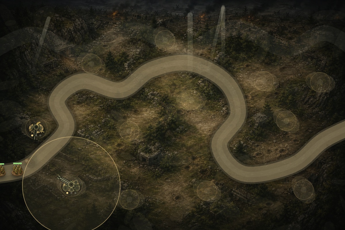
There is still a design tradeoff. Procedural or route-driven roads can look too clean if they are not styled carefully. Early versions of the new road layer were too bright and too dominant. The road solved the alignment issue, but it overpowered the base map. The fix was to reduce road opacity, darken the road color palette, soften shoulder details, and brighten the base art. That made the road useful without making it feel like a flat overlay.
Build pads needed the same treatment. A pad must be visible enough for the player to click, but not so bright that the battlefield looks covered in UI circles. The final pass reduced pad clearing opacity, ring strength, center dots, route guide dashes, and road highlights while preserving hover and selected states. This is a common tower defense tension: before the wave starts, the map needs to teach placement options; during combat, it needs to let the player see enemies, effects, and tower fire.
The route work changed how future maps should be built. Start with the gameplay path. Decide the entry, exit, major turns, choke points, bridge moments, and build pad opportunities. Draw or generate terrain around that plan. Render the road from the path data. Validate pad clearance. Then take screenshots with infantry, trucks, tanks, and aircraft, because each unit exposes different alignment problems. The path is not finished until it looks right under actual battle conditions.
For Allied Frontline Defense, this process turned a frustrating visual bug into one of the game's strongest systems. The newer maps no longer fight between a painted road and a hidden movement path. They use the path as the source of truth. That is the main lesson for any HTML5 Canvas tower defense game: do not let the player guess where enemies will go. Make the route visible, honest, and synchronized with every system that depends on it.
The Route Checklist I Would Use From the Start Next Time
If I were starting this map again, I would define the route checklist before drawing the first production background. The entry point must match a visible doorway, road end, beachhead, gate, tunnel, or battlefield opening. The exit must be equally clear. The route should have enough curves to create tower placement choices, but not so many tight bends that enemies jitter or overlap. Narrow places such as bridges must be marked early because they affect lane spread, vehicle scale, and build pad placement.
The next item is route width. A road is not just a line. It has a playable width, and that width should change only when the map gives the player a visual reason. A broad field road can support a little enemy variation. A bridge or bunker entrance should tighten the formation. Infantry squads can afford more visual scatter than tanks. Aircraft should not use this ground road logic at all. Writing those rules down prevents later fixes from becoming a chain of unrelated offsets.
Build pads should be validated after every route edit. The question is not only whether a pad overlaps the path mathematically. It is whether a player can understand the relationship at battle speed. A pad near a curve may be excellent if it covers two segments. A pad on the inside shoulder of a narrow road may look confusing even if it passes a simple distance check. Screenshots with towers built on every nearby pad are more useful than an empty map because they reveal whether the tower body, range circle, road, and enemy formation still read cleanly.
Finally, every route should be tested with representative units, not just one enemy type. Infantry exposes spacing problems. Trucks expose lane width. Tanks expose bridge and turning issues. Aircraft exposes whether airspace is truly independent. Late waves expose whether health bars, projectiles, smoke, and explosions obscure the road. That is the standard I would use before calling a tower defense route finished: the route must be honest when the map is quiet, and it must remain readable when the battlefield is crowded.
One more practical rule came out of this project: never tune a route only from the designer's memory of the map. Open the actual page, start a real wave, and watch the units cross the most visually specific places. In Allied Frontline Defense, the bunker mouth and bridge deck revealed problems faster than any coordinate table did. Those landmarks became the route's truth test because they gave the eye something precise to compare against.