In This Map Design Log
Why One-Image Maps Caused Problems
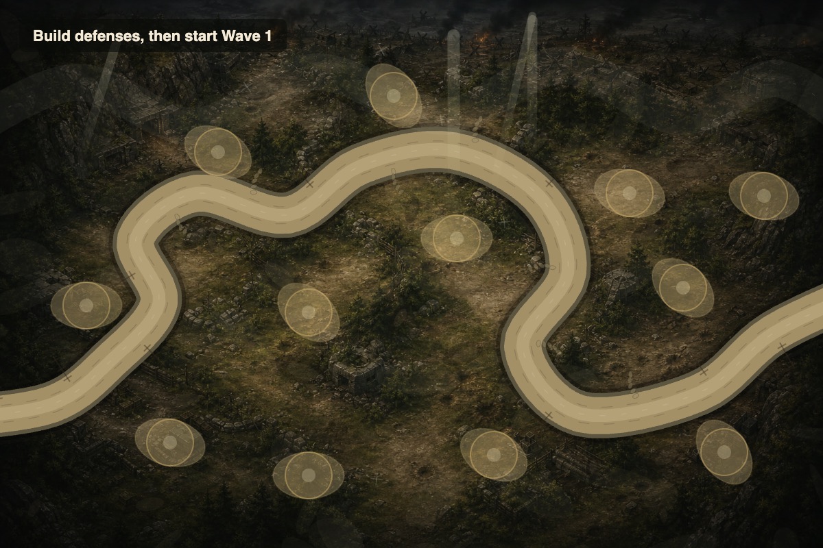
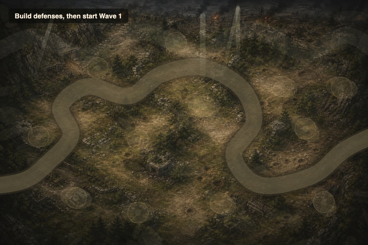
The first Allied Frontline Defense map used a beautiful battlefield image with a visible road, river, bridge, bunker entrance, and defensive positions. It looked like a finished tower defense map, but it also introduced a structural problem: the road was already baked into the artwork. The enemy movement path had to be traced over that road after the fact. Every small mismatch became visible to the player.
This issue showed up repeatedly. The enemy entrance needed correction. Ground units needed upward shifts. The path needed to move right and up. Tanks needed to sit on the bridge deck. Build pads had to move off the enemy route. The fixes improved the original map, but they also revealed that the pipeline was fragile. If every map required hand-adjusting enemy waypoints against a baked road, adding new maps would multiply the same problem.
A tower defense map has several responsibilities. It must create atmosphere. It must show where enemies move. It must show where towers can be built. It must leave enough room for projectiles, effects, aircraft, and UI overlays. It must stay readable before and during combat. A single static image tries to solve all of those responsibilities at once. That can work for a painted map, but it becomes hard to revise when gameplay changes.
The user's suggestion to think in layers was the right direction. Instead of asking one image to contain everything, the map can be built as a stack. The base art can focus on mood and terrain. The road layer can come from the real enemy route. The tower pad layer can be placed and validated separately. The airspace layer can show aircraft activity without interfering with ground movement. This approach is common in spirit across many strategy and tower defense games: separate what the player sees from the data that controls play, but keep them synchronized.
The Four-Layer Map Model
The final approach for Allied Frontline Defense can be understood as four major layers. The first layer is the base map art. This is the terrain image: forest floor, snow ridge, coastal gun position, ruined fields, cliffs, water, rubble, trees, tents, rocks, and lighting. The base layer should be beautiful, but it should not contain the final enemy road or final build pads. It is the stage, not the gameplay diagram.
The second layer is the route and road layer. This is where the biggest improvement happened. The road is drawn from the same route data that enemies follow. If the route bends, the road bends. If the route shifts, the road shifts. This removes the old mismatch between the road image and actual enemy movement. It also means new maps can be built faster because the road does not need to be manually painted into a separate background and then reverse-engineered into waypoints.
The third layer is the tower pad layer. Build pads are authored separately from the road and checked for clearance. They can be drawn as subtle clearings, rings, or center marks. They can have hover feedback and selected states. They can be moved without repainting the whole map. This matters because build pads often need adjustment after playtesting. A pad that looks fine before combat may overlap a range circle, hide under a tower, sit too close to a route, or fail to offer a meaningful tactical choice.
The fourth layer is airspace. Aircraft should not share the exact same visual logic as ground units. They need freer routes, higher visual placement, shadows, contrails, and enough screen area to feel like they are moving above the battlefield. Separating airspace cues from the road layer helped the game treat aircraft as their own threat family instead of just enemies with a vertical offset.
Making New Maps Feel Different Instead of Merely Recolored
When more maps were added, they initially risked feeling too similar. This is a common problem in small browser games. If the same road shape, same pad rhythm, and same terrain density appear under different colors, the player does not experience true variety. A map should change decisions, not just the background.
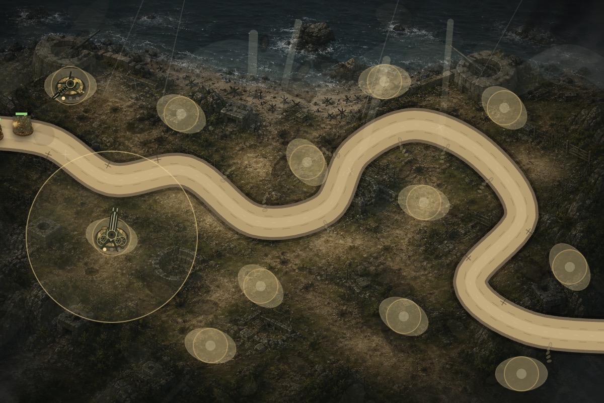
The beta added Forest Pass, Coastal Battery, and Snow Ridge alongside the original River Crossing. Each map needed its own terrain mood and its own route identity. Forest Pass could feel enclosed, with trees and dirt lanes. Coastal Battery could feel more exposed and military, with harder terrain and coastal defensive structures. Snow Ridge could feel colder, brighter, and more open, with snowy contrast affecting readability. The goal was to make a player recognize the map from a screenshot and also adjust their build plan when playing it.
Each map also received its own build pads, route length, starting-resource modifier, life count, and difficulty treatment. Those numbers are just as important as the art. A map with a short route should feel more urgent. A map with strong choke points can support different tower placements. A map with more open space can give aircraft more visual room. A map with fewer lives changes the player's tolerance for leaks. Good map variety comes from the relationship between terrain, route, pads, enemies, and economy.
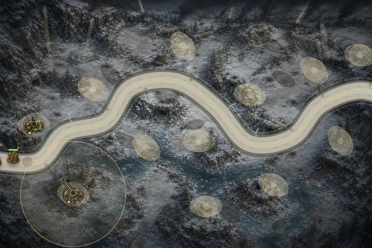
Visual variety still needs restraint. The interface, tower silhouettes, route treatment, and pad behavior should remain familiar across maps. If every map changes every visual rule, the player has to relearn the game. The better approach is to keep the grammar stable and vary the terrain, route shape, tactical pressure, and mood. Allied Frontline Defense moved in that direction: the player can recognize the game system while still feeling that each map has its own battlefield character.
Tuning Transparency, Road Brightness, and Base Art Lighting
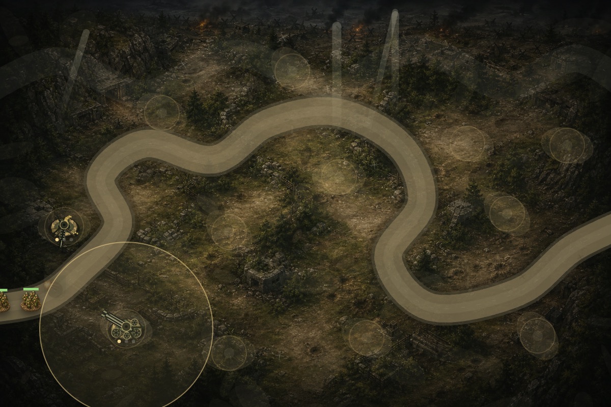
The first layered maps solved route matching, but they created a new problem: the road and tower positions were too visually heavy. A route-driven road can become a bright graphic overlay if it is not tuned. The user feedback was direct: make the route and defense tower positions more transparent, lower the road brightness, and raise the base map brightness. That feedback was exactly right because the first version made the functional layers too loud.
The tuning pass reduced road surface opacity, shoulder details, route guide dashes, pad clearings, pad rings, and pad center dots. Then the road palette was darkened and the base maps were brightened by reducing vignette and haze strength. The aim was to let the terrain art show through while preserving gameplay clarity. Before a wave, the player still needs to find build spots. During combat, the player needs to see enemies, towers, explosions, smoke, and projectiles.
There is no single perfect opacity value because readability changes by map. Snow needs different contrast from forest. Coastal terrain needs different edge treatment from mud. A route that is readable on a dark map can disappear on a pale one. The important principle is to tune layers in context, with actual towers and enemies on screen. A clean empty map screenshot is not enough. A tower defense map must survive the busiest wave.
The build pad layer has the same challenge. Empty pads need to be visible enough for a first-time player. Built towers need to replace pad emphasis once the player has made a choice. Selected towers need stronger feedback. Unavailable or blocked placements should not look like active commands. The map therefore needs different visual states, not just one pad graphic. Allied Frontline Defense kept the pad cues subtle by default and stronger on interaction.
The Map Workflow for Future Updates
The layered approach suggests a stronger future workflow for any new Allied Frontline Defense map. Start with the gameplay route. Decide where enemies enter and exit, where the main bends happen, where choke points should sit, where a bridge or narrow pass can create drama, and where towers should have interesting choices. Then create base art that supports that plan without baking in the final road or pad markings.
Next, draw the road from the route data. This keeps visible road and enemy movement synchronized. Then place tower pads as separate authored objects and validate their distance from the route. After that, define airspace behavior: possible aircraft entry edges, exit edges, route control points, altitude feel, and areas where aircraft should visually cross the battlefield. Finally, run real combat scenarios with infantry, trucks, tanks, aircraft, bombers, counter-fire enemies, and late-wave density.
This workflow is slower than dropping a finished image into the game, but it pays off. It makes the map more editable. It prevents road mismatch. It lets pad balance change without repainting. It gives aircraft their own design space. It also improves SEO content value because the development story becomes concrete: the article can show the real production problem, the design principle, the visual iteration, and the final result with screenshots.
The biggest lesson is that map beauty and map honesty must work together. A gorgeous tower defense map fails if enemies ignore the road. A perfectly accurate route fails if the map looks like a flat diagram. Layering lets the project separate those concerns and tune them together. The base art can be rich. The road can be honest. The pads can be subtle. The aircraft can be free. The gameplay can remain readable.
For a browser game, this is especially valuable because the entire experience happens in one canvas and one page. There is no heavy engine editor hiding the complexity. Every layer must be intentional. Allied Frontline Defense became stronger when the map stopped being a static backdrop and became a stack of coordinated gameplay surfaces. That is the map architecture I would use for the next expansion as well: start from route truth, keep the base art clean, author tower positions separately, and verify the result in real waves before calling it finished.
A Production Checklist for the Next Map Pack
The next map pack should begin with a short written map brief. The brief should state the mission fantasy, the expected route shape, the primary enemy pressure, the likely tower placement challenge, and the visual mood. A forest ambush, a coastal battery, a snowy ridge, and a ruined town should not differ only by texture. Each should imply a different tactical problem. That brief gives the art, route, pads, and waves a shared target.
After the brief, the route should be blocked in before final art. The designer should place entry, exit, major turns, narrow points, and wide fields. The route should then be tested as a plain line with simple units. If the path is boring as a line, a beautiful base map will not save it. Once the route works, base art can be generated or painted around it without baking in the final road. This keeps the map attractive while preserving gameplay control.
The next step is pad design. Pads should create choices across the whole route: early coverage, bend coverage, bridge coverage, anti-air support, late-road insurance, and risky high-value positions. Every pad should have a reason to exist. If two pads always produce the same decision, one can move. If a pad is never useful, it should either gain a stronger route relationship or be removed. This kind of pad editing is much easier when pads are a separate layer rather than part of the background image.
Then comes visual tuning. The base art should be checked with no overlays, with road only, with pads only, with towers built, and during a dense wave. The road should be visible but not loud. Pads should be discoverable but not decorative clutter. Aircraft shadows should not look like ground enemies. Smoke and fire should not hide the road. Range circles should support decisions without covering everything. The map is not approved until all of those states remain readable.
Finally, every map should ship with screenshots for future dev logs and site cards. Good screenshots are not just marketing assets. They are inspection tools. They reveal mismatched routes, weak contrast, awkward tower scale, overloaded panels, and confusing enemy clusters. For Allied Frontline Defense, screenshot review repeatedly found the real problem faster than abstract reasoning did. The next map pack should make that review part of the process from day one.
The workflow should also preserve source separation. Keep base art files, compressed browser files, route data, pad data, and article screenshots in predictable places. That may sound like housekeeping, but it affects production speed. When a map needs a brightness pass, the base art should be easy to replace. When a route needs a shift, the road should update from data. When a dev log needs images, the screenshots should already be curated and named clearly. Clean asset organization makes the next iteration less risky.
Most importantly, the map pipeline should be judged by how confidently it supports new content. A good layered map system should let the game add a new mission, new route, or new environment without reopening every old road problem. Allied Frontline Defense reached that point only after the project stopped treating roads and pads as painted decoration. Once they became gameplay layers, the maps became easier to reason about, easier to test, and easier to explain to players.
This also gives the dev-log content a stronger foundation. Instead of presenting maps as mysterious finished screenshots, each article can explain what the layer is doing and why it improves play. That makes the writing more useful for other browser game developers and more credible for players who want to understand how the beta is evolving. The production method and the published story support each other across future updates and future map releases for the campaign.