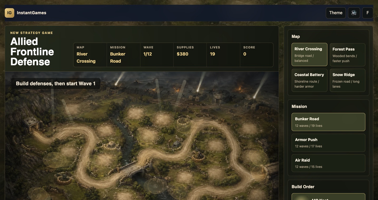
In This Weapon Design Log
Why the First Towers Felt Wrong
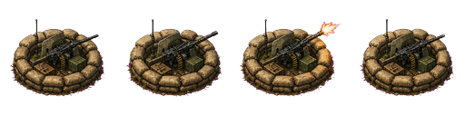
The first version of Allied Frontline Defense had functioning towers, but functioning is not enough for a tower defense game. The player needs to believe the weapon is actually sitting on the battlefield and firing at the target. Early towers looked too simple, too upright, and sometimes too detached from the terrain. The problem was especially obvious for MG Nest. When the machine gun did not appear to face the incoming enemies, the whole scene felt less tactical, even though damage numbers were being applied correctly.
This is a common problem when generated game art is used directly in a canvas game. A generated tower can look good as a standalone image, but it may not match the perspective, scale, lighting, and rotation needs of the live battlefield. A side-view gun might look detailed in a square icon, but if it is placed on a three-quarter top-down map, it can appear to stand vertically. A baked muzzle flash can make an attack frame look exciting, but if the target is on the other side of the tower, that same flash becomes evidence that the gun is firing in the wrong direction.
The solution was to separate inspiration from runtime rendering. The generated sheets were still useful. They helped define the visual vocabulary: sandbags, metal barrels, small gun shields, olive paint, ammunition crates, field hardware, and worn military silhouettes. But the battlefield towers needed a different treatment. They had to be low-profile, directional, readable at small size, and capable of pointing toward any target. That meant drawing the battlefield tower bodies and weapon layers in the game rather than relying only on full sprite frames.
That decision also helped the game avoid a mismatch between the war theme and the actual play surface. A WWII-inspired defense game needs recognizable equipment, but the player views it from a gameplay camera. The camera is not inspecting a museum model. It is reading tactical information while enemies move, shells explode, range circles appear, and the panel asks for decisions. The tower design had to compress enough real-world flavor into a small, readable battlefield symbol.
Fixing Aiming: The Barrel, Projectile, and Flash Must Agree
The aiming pass was the first major tower improvement. Early towers could select targets and fire mechanically, but their visual barrels did not always follow the target. This created a gap between simulation and presentation. In a tower defense game, the player reads tower behavior through motion: a turret turns, a muzzle flashes, a projectile travels, and an enemy reacts. If those four signals disagree, the player stops trusting the combat.
The fix required every tower to track a live target angle. Once a target was selected, the tower stored the direction to that target and rendered the weapon layer around that direction. The projectile origin moved to the actual muzzle point. The muzzle flash was drawn from the same direction. Stale targets were cleared when enemies left range or were destroyed. That last detail matters because a tower that keeps pointing at a dead target feels broken even if it reacquires correctly a moment later.
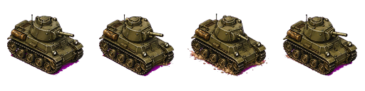
The team also learned that rotating the full generated attack sprite was not enough. Some generated frames included baked highlights or attack flashes that still implied a fixed direction. The better approach was to use the clean visual language from the generated art, then draw custom directional barrels and custom directional effects in the canvas. This gave MG Nest, Anti-Tank, Artillery, and Flak Radar consistent behavior. They could share the same aiming principle while still keeping different silhouettes and attack rhythms.
The result was immediate. MG Nest became a fast-firing sandbag weapon instead of a static decoration. Anti-Tank felt like a heavier field gun because the long barrel had a clear direction and a stronger report. Artillery could lob slower, heavier shots with a different visual cadence. Flak Radar could track aircraft with a distinct anti-air identity. The towers did not need photorealism. They needed believable intent.
Grounding the Towers: Low Profile, Correct Scale, and Battlefield Detail
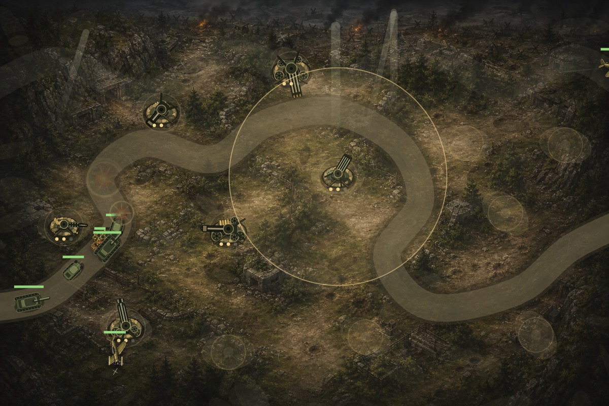
After aiming, the next issue was scale and perspective. Some towers looked too large for the battlefield and too vertical for the map. This is where the project moved to compact, top-down or three-quarter tower drawings. The base became a sandbag ring or grounded platform. The weapon sat inside that base. Level pips moved closer to the tower. Muzzle flashes became smaller. Range circles stayed available for gameplay, but the tower itself stopped dominating the terrain.
Detail was added carefully. More detail is not always better on a small canvas object. The player should be able to identify the weapon type at a glance. The pass added MG cooling jackets, ammo belts, stacked crates, anti-tank wheels, field gun shields, artillery carriage parts, shell racks, flak barrels, radar dishes, cable coils, support legs, rivets, and denser sandbags. Each detail helped the tower feel more like battlefield equipment, but the silhouettes remained simple enough to read during combat.
This pass also improved the relationship between towers and build pads. A tower should feel like it was constructed on a prepared defensive spot, not dropped onto the center of the road. The sandbags and base geometry helped attach it to the terrain. Once the route alignment moved build pads away from the enemy road, the tower art had room to breathe. The player could see enemies pass nearby, projectiles leave the tower, and the tower's range cover a meaningful segment of road.
Scale tuning affected enemies too. Tanks, trucks, infantry, and aircraft all had to be resized so towers did not feel tiny beside them. A battlefield can become unreadable when every unit is drawn like a hero asset. The game needed many objects moving and firing at once, so the visual language had to be compressed. The best tower scale is not the one that shows every rivet. It is the one that lets the player understand the whole fight without pausing.
Making Each Weapon Role Readable
Visual design and gameplay role had to develop together. MG Nest is the fast-fire starter tower. It should look busy, low, and practical. Anti-Tank is the armor answer. It should have a longer, heavier barrel and a field-gun silhouette. Artillery is the splash weapon. It needs a squat platform, shell cues, and a slower visual rhythm. Flak Radar is the anti-air solution. It needs to read differently from ground weapons, with vertical tracking cues, multiple barrels or radar hardware, and a clear reason to exist before aircraft arrive.
When Mortar Pit and Rocket Battery were added later, the same principle applied. Mortar Pit helps with infantry clusters and pressure around bends. Rocket Battery gives late-game armor coverage. Those two towers were not just extra buttons. They were added because the enemy roster had grown. Storm infantry, half-tracks, assault guns, heavy tanks, bombers, and fighter aces created more pressure than the original four towers could comfortably express. A bigger enemy roster needs a wider defensive vocabulary.
Good tower design also depends on weakness. If one weapon solves every problem, the build order becomes stale. MG Nest should struggle against heavier armor. Anti-Tank should not be the best answer to swarms. Artillery should reward prediction and clusters but not replace every direct-fire option. Flak should matter against aircraft and feel less efficient elsewhere. Mortar and Rocket should feel like late roster additions with specific reasons to buy them. The tower panel communicates those roles through short labels, but the battlefield has to reinforce them visually.
Sound helped here as well. The game moved from simple procedural tones to more specific battlefield audio: machine gun bursts, anti-tank cannon reports, artillery boom and rumble, flak bursts, bullet hits, shell impacts, vehicle destruction, tank treads, engines, and aircraft passes. Weapon sound is a form of UI. It tells the player which towers are active and whether the defense is handling the wave. The sound design was restrained so it added identity without turning into constant noise.
Matching Battlefield Towers and Build Icons
One of the later visual issues was inconsistency between the built towers on the map and the pictures in the Build Order panel. The panel still had older generated side-view tower images, while the battlefield used redesigned low-profile tower drawings. This made the game feel less polished. When a player buys a tower, the preview and the placed object should look like versions of the same thing. If they do not, the player has to mentally translate the UI.
The fix was to replace the old tower-card backgrounds with runtime-drawn mini icons that used the same visual language as the battlefield towers. Sandbags, bunker bases, wheels, shields, barrels, flak hardware, and weapon silhouettes became consistent across both surfaces. The icon did not need to be a perfect miniature copy. It needed to be recognizable as the same tower family. This made the build panel feel more connected to the game world.
The sprite pipeline still mattered. It gave the project a visual starting point and helped establish an asset workflow. Animation sheets were generated, postprocessed, checked for edge issues, and wired into the game where they made sense. But the final tower solution showed that generated art should be adapted to the play camera. The goal is not to preserve every generated frame. The goal is to make the game better.
The final tower roster feels stronger because each weapon is now doing three jobs at once. It communicates a gameplay role. It belongs to the WWII-inspired battlefield. It behaves honestly when it fires. That combination is more important than raw image detail. A small tower that aims correctly, sits on the ground, matches its icon, and produces the right sound will feel better than a beautiful standalone sprite that ignores the target or clashes with the map.
The broader lesson for browser game development is simple: tower art must be designed for interaction. It needs to survive small sizes, rotation, hover states, range overlays, damage effects, and rapid player decisions. Allied Frontline Defense improved when the towers stopped being static images and became active battlefield instruments. The weapons now tell the player what they are, where they are aiming, why they matter, and when they are under threat.
The Weapon Checklist That Came Out of This Pass
After the tower redesign, I would not judge a weapon tower only by whether the image looks impressive. The first question is whether the tower has a readable silhouette at gameplay size. If the player has to zoom mentally to distinguish it, the design is too busy or too similar to another tower. The second question is whether the tower's job is visible before reading the text label. A machine gun should look fast. A field gun should look heavy. A flak weapon should signal anti-air. A mortar should imply indirect splash. A rocket battery should suggest late-game armor pressure.
The third question is whether the tower can aim honestly. Any tower with a barrel, dish, launcher, or turret needs its active direction to match the target. The muzzle position, projectile path, impact effect, and sound should all agree. If the image contains baked attack direction, it may work as an icon but fail in live combat. That is why the final battlefield towers became layered drawings instead of full attack sprites. The weapon body could stay grounded while the active barrel and firing effects followed the target.
The fourth question is whether the tower belongs to its build pad. A tower should not float. It should have a base, shadow, sandbags, wheels, braces, or terrain contact that makes it feel installed. This is especially important in a WWII-inspired game because the visual fantasy is field engineering: soldiers are building defensive positions under pressure. A tower that looks like a sticker breaks that fantasy. A tower with crates, supports, and a believable footprint reinforces it.
The fifth question is whether the tower remains clear when damaged or selected. Allied Frontline Defense added tower durability and repair, so towers are not merely permanent upgrades. The art has to leave room for health bars, smoke, disabled states, range circles, and selection rings. A tower that looks good in isolation may become messy once all of those states appear. The safest weapon design is one that has a strong core shape, then uses small detail and state effects around it rather than relying on fragile decoration.
The final question is whether the icon and battlefield object feel like the same purchase. This matters more than it seems. The player builds from the panel and then verifies the choice on the map. If the icon and placed tower disagree, the player experiences friction. The final mini-icons solved this by sharing the same sandbag, barrel, shield, and support language as the battlefield towers. That consistency made the roster feel intentional, which is exactly what a growing tower defense game needs.
This checklist also protects future additions. If a new tower is added later, it should not enter the roster just because it looks impressive. It should answer a real enemy pressure, occupy a clear price point, produce a distinct sound, and create a new placement decision. It should also work in the compact panel, at battlefield size, under range overlays, and during crowded late waves. That standard keeps the tower roster from becoming a pile of attractive but redundant weapons.
For Allied Frontline Defense, the weapon pass turned the towers into one of the game's clearest signals. A player can now glance at the battlefield and understand where the rapid fire is, where the heavy armor answer is, where splash damage is coming from, and which defenses are meant for aircraft. That is the real goal of weapon art in a tower defense game: not just to look military, but to make the tactical state legible.