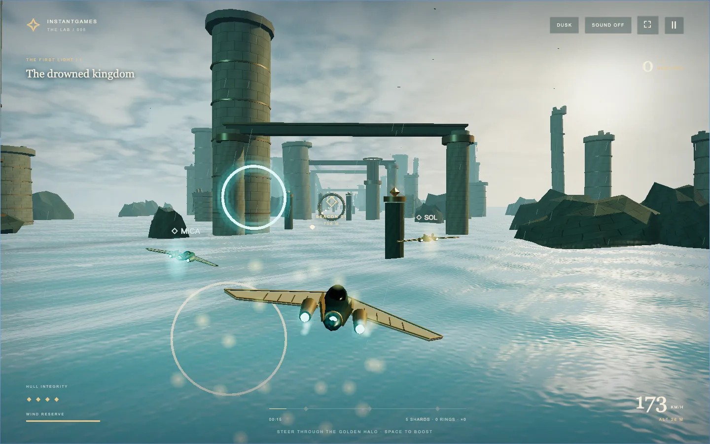
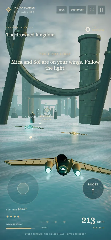
I started with a three-minute journey over an ancient sea. I ended up spending much of the iteration on things a still image cannot show: whether a collision stops the ship, whether a wingmate recovers from a turn at its own pace, and whether an enemy visibly arrives before it starts shooting. This is the development story of turning that first view into Storm Courier.
1. Start with one flight worth finishing
The first brief for Storm Courier was small enough to picture: skim a stormy sea, weave through enormous ruins, collect light, and wake a monument at the end of a roughly three-minute journey. I wanted the flight to feel like travelling through a place that existed before the player arrived. The danger was obvious: an attractive fly-through can look finished long before it becomes a game.
I kept forward travel automatic. The player controls lateral movement and altitude, with a limited boost reserve. That removes throttle management and leaves attention for gaps, pickups, and the horizon. It also gives the level a useful spine: distance along the route. A beacon, a ruin, and an interception can each have a position along that spine instead of depending on an unpredictable wall-clock timer.
The first complete route is 8.4 kilometres long. At default speed, a successful run takes about 175 seconds before the awakening sequence. Those numbers were a scope constraint, not a realism claim. They gave me a beginning, a middle, and an end I could actually replay after a change. Before adding more scenery, I needed steering, failure, checkpoint recovery, and a visible finish to work together.
2. Build the view around the route, not the other way around
The game uses JavaScript modules and a locally vendored copy of Three.js r170. There is no application bundler in this game folder. The world, routes, flight logic, combat, wingmates, and audio have separate modules. That split mattered when the enemy design changed repeatedly: I could rebuild an aircraft without rewriting beacon progression.
The visual recipe is layered. A moving sea gives the foreground texture; fog separates distant architecture; cloud and sky colour establish the weather; stone and bronze keep the ruins in a consistent material family. The skimmer and its trails supply the scale reference. None of those layers has to carry the entire image.
The hard part was keeping the route legible. A column is an excellent composition tool until it blocks the only reasonable approach to a beacon. Once collisions became fatal, some opening scenery had to move. I treated that as level design work, rather than reducing collision accuracy to preserve a screenshot.
For a similar project, I would place the intended flight corridor first, put the largest landmarks around it, and then fly the route from the actual chase camera. A free camera makes gaps look generous. A moving camera, a banking ship, and a bright pickup can make the same gap difficult to read. The useful question is whether the player can understand the next action while moving.
3. Make collisions mean what the scenery promises
One of the most useful pieces of feedback was blunt: the ship could collide and keep flying, and the journey felt too monotonous. Those were connected problems. If the architecture looks solid but does not stop the player, the world loses both credibility and tension.
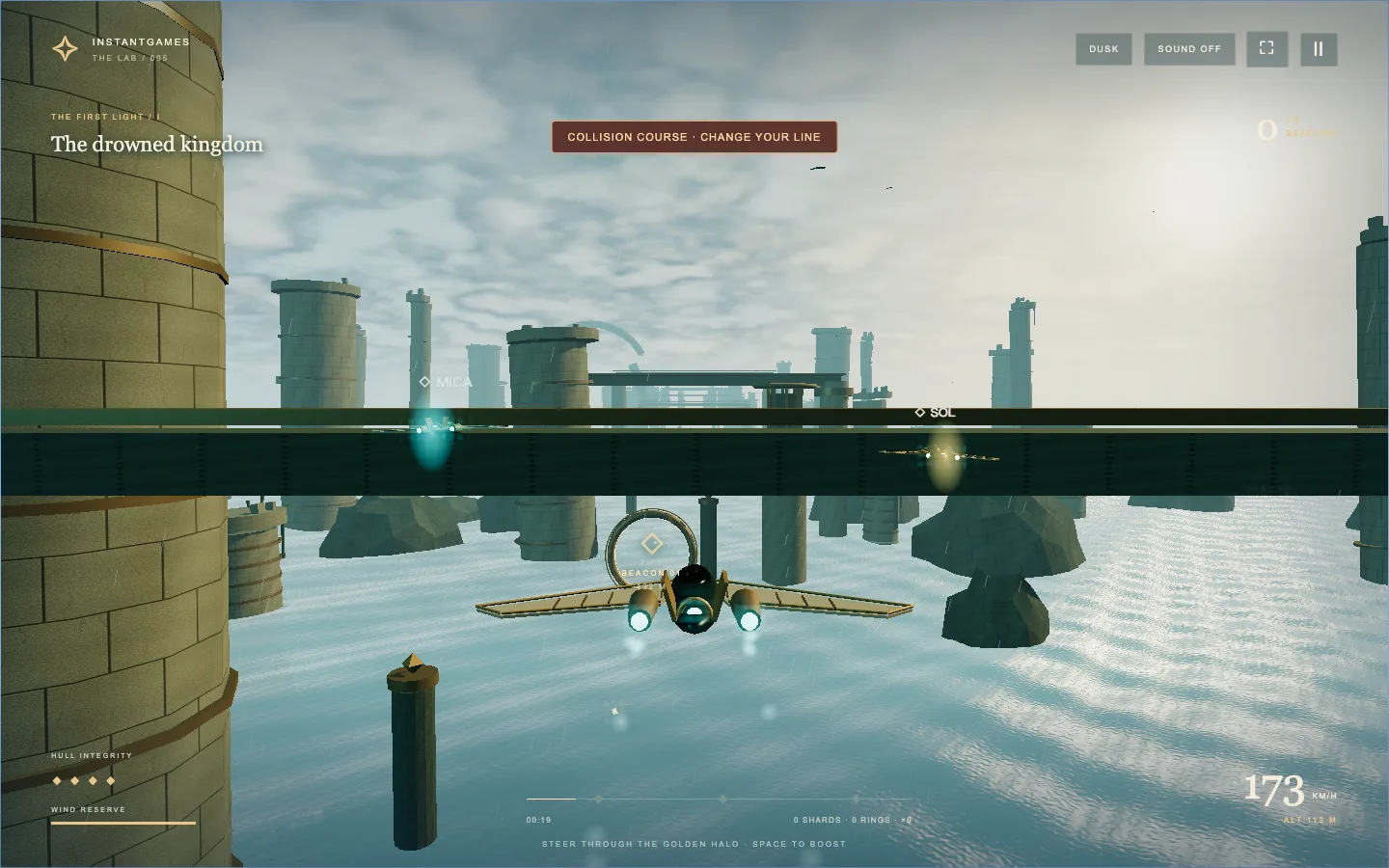
The current rules distinguish two kinds of danger. Enemy shots consume the four hull points. Hitting solid ruins, the sea, or a moving sentinel ends the flight immediately. The distinction makes the scenery worth respecting without requiring every stray shot to restart the run. It also means the failure message must explain what happened.
Changing the penalty was only half the job. A warning needs to appear before impact, and the opening route still needs a safe line. Collision checks must cover the movement between simulation steps so that boosting does not let the ship skip through a solid object. Rendering and collision also need to agree about where moving hazards are.
Checkpoint retry keeps this strict rule tolerable. The player should retry the failed approach rather than repeat the entire introduction. I checked not only that a loss screen appeared, but that forward motion stopped and retry restored a playable state. A crash that still lets the world advance behind the menu is a different bug from a missing crash screen, and a screenshot alone will miss it.
4. Give the player a reason to leave the safe line
Required golden beacons provide direction, but they do not offer much choice by themselves. Blue slalom rings add an optional line through the scenery. Consecutive rings increase the reward; a miss resets the combo. Rings also replenish boost energy. Light shards contribute score and energy, and later became part of the squad-strike economy.
This creates a small decision without introducing a new menu. Staying on the easy line is valid. Banking toward a ring may earn more speed and points, but it also changes the next approach. The reward lives in the same space as the risk.
I separated pickup feedback by meaning. Shards stream toward the craft, slalom rings burst blue, and beacon pickups burst gold. The initial effect treatment needed restraint: a large collection halo can obscure the next obstacle. I thinned the halos and kept a gentler presentation option. When the game is already asking someone to fly through a narrow space, celebration should not cover that space.
Transient effects use simulation time and reusable pools. Pausing should freeze a celebration rather than leave it animating while the ship is stopped. Restarting should clear it. That is an unglamorous detail, but it prevents a previous run from visually leaking into the next one.
5. Two wingmates need two different rhythms
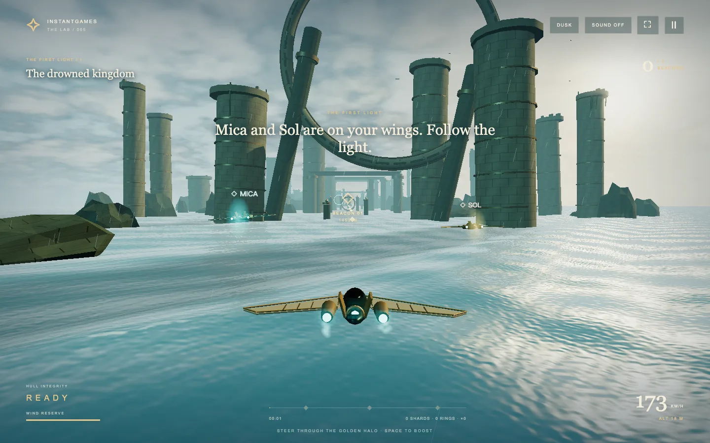
Mica and Sol started as a way to make the flight feel less lonely. Mica carries cyan accents; Sol carries gold. Placing a smaller ship on each side was straightforward. Making them feel like separate companions took another pass.
The first problem was synchronized movement. If both companions bank, rise, and recover at the same instant, they read as attachments to the player. Mica now follows and banks more quickly; Sol turns more gently and settles later. Their cruise variation has separate phases, and pickup reactions are staggered. The difference comes from timing and response, not a large animation library.
Those offsets need limits. A convincing lag that sends a wingmate off the edge of a phone screen is not useful. The formation narrows on small screens, and it folds inward near detected ruins. I kept the central aiming lane clear instead of treating a symmetrical screenshot as the final layout.
Combat gave the companions functional identities. Mica moves forward and fires more often. Sol covers the player and can block a shot on a cooldown. That makes their presence matter without asking the player to issue separate orders. I also checked that pause freezes their state and that retry clears old banking and boost values; otherwise the first frame of a new attempt inherits the last frame of a crash.
6. Rebuild the enemy silhouette before adding more details
The enemy aircraft went through several rejected directions. Early patrol craft were too close to the courier. A copper beetle experiment made the sides easier to distinguish, and a Blender version explored the carapace, legs, and jets. But that still missed the supplied stealth-fighter reference. Being different from the player was not enough to satisfy the art direction.
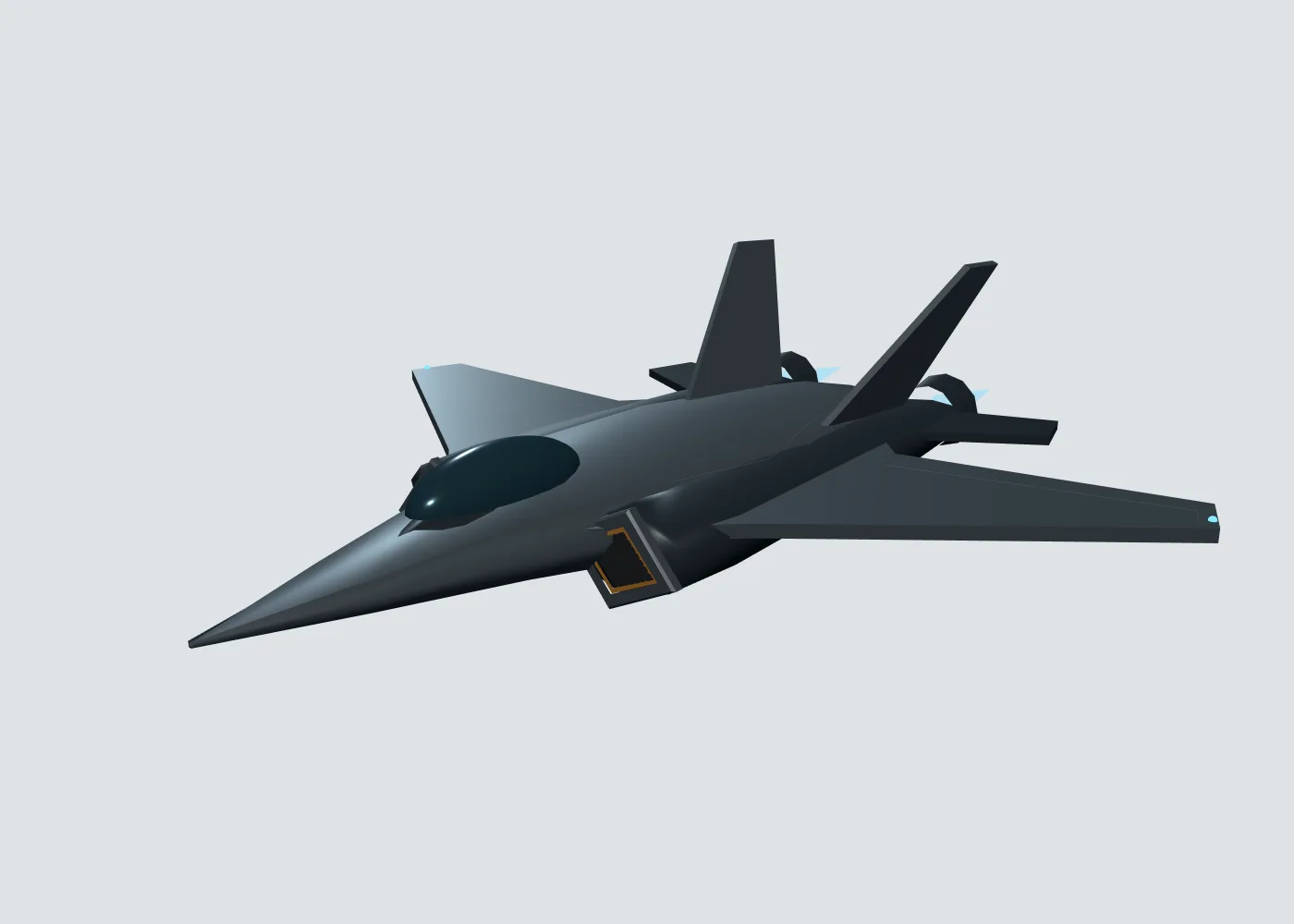
The later rebuild moved the runtime craft into its own module. The useful change was a more continuous structure: hull sections joining into a fuselage, a canopy that belongs to that fuselage, broad wings, engine shoulders, recessed gold-edged intakes, and twin exhausts. Adding little boxes to an unresolved body had not fixed its silhouette.
I used front, side, top, and three-quarter preview cameras to expose different mistakes. The front view is useful for intake spacing and wing balance; the side view catches a canopy or engine that appears to float; the top view reveals whether the planform holds together. The combat-distance view is the final check, because that is where the player actually sees the craft.
The image below is a model-preview render, not a gameplay screenshot. The current enemy is a stylized procedural game model. It should not be described as a photoreal recreation of the reference, and the earlier Blender experiment should not be confused with the final runtime asset. That distinction is part of an honest dev log: an attractive tool output does not prove that the same asset shipped in the game.
7. Design the arrival and departure, not just the fight
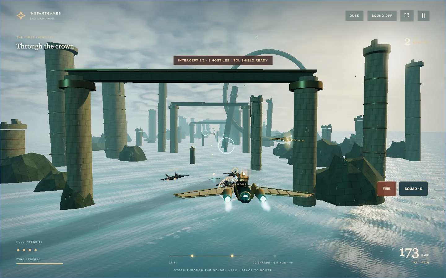
The original combat addition was a single patrol. It proved that firing, enemy damage, Sol’s shield, and squad strikes could work. It did not solve pacing across a full voyage. The next feedback was that enemies appeared only once and their arrival felt unreasonable.
Each voyage now has three separated interception windows, with three aircraft in each. On The First Light, the windows begin at 2.67, 4.65, and 7.35 kilometres. The other routes use their own distances. Spacing by progress keeps encounters attached to places in the journey even when the player boosts.
An encounter has a readable sequence. Aircraft approach from a distant port or high starboard position over 4.5 seconds before attacking. Orange markers lock a position before incoming shots arrive. If aircraft remain when the window ends, they climb and accelerate away over a departure phase. Between interceptions, the patrol is hidden and the squad returns to exploration.
4.5 seconds, no firingAttack
Locks, dodge, return fireDepart
Climb out of the route
That sequence gives the player a chance to notice, prepare, react, and breathe. It also creates specific things to verify: no approach-phase fire, visible movement into range, a correct heading during departure, and no leftover aircraft floating between windows.
Player fire needed attention as well. A weapon can technically work while feeling ineffective from the chase camera. Target assistance was widened so held fire can track an enemy in the combat zone. The squad strike spends 12 collected shards, tying exploration back into combat. I checked that player shots themselves reduce enemy armour, rather than accepting a victory caused entirely by companion fire.
The second and third waves exposed a recovery assumption: retry could no longer jump to a single hard-coded first-encounter position. It must return to the current wave’s start while retaining already earned rewards and destroyed enemies. Whenever a one-off event becomes a repeated system, I now look for fixed reset positions before adding more content.
8. Expand the campaign through different flying demands
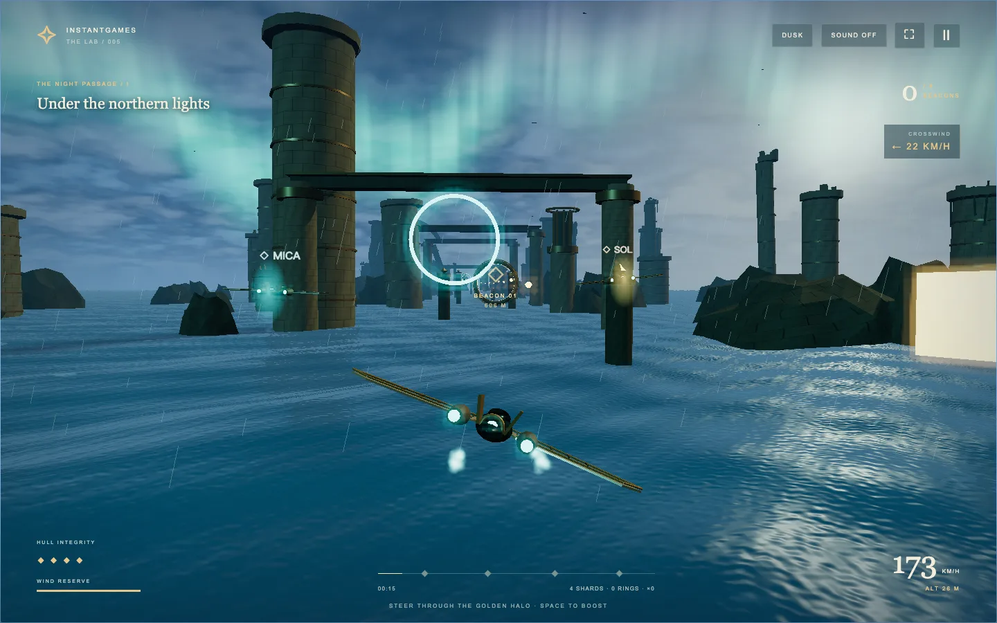
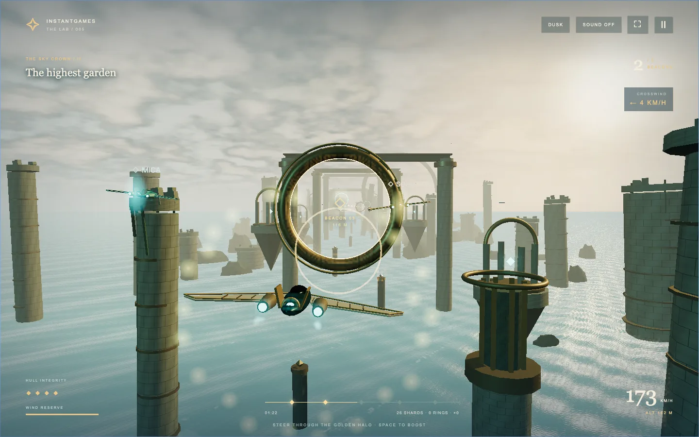
Once the original voyage worked, I kept it as The First Light and added two routes. The Night Passage uses an aurora sky, a cooler sea, stronger crosswind, and four beacons. The Sky Crown lifts the route toward suspended islands and asks for five beacons. Across the campaign, that makes twelve required beacons.
The important variation is what the player does with their hands. Crosswind asks for correction. Moving sentinels make timing and altitude matter. Higher routes change the relationship between the ship, water, and landmarks. A new palette helps establish a place, but it cannot carry the whole difference between levels.
The voyage atlas unlocks routes sequentially and saves independent records. Route switching also has to dispose of the previous scene’s resources. Otherwise a short demo can look fine on its first run while repeated visits become progressively more expensive.
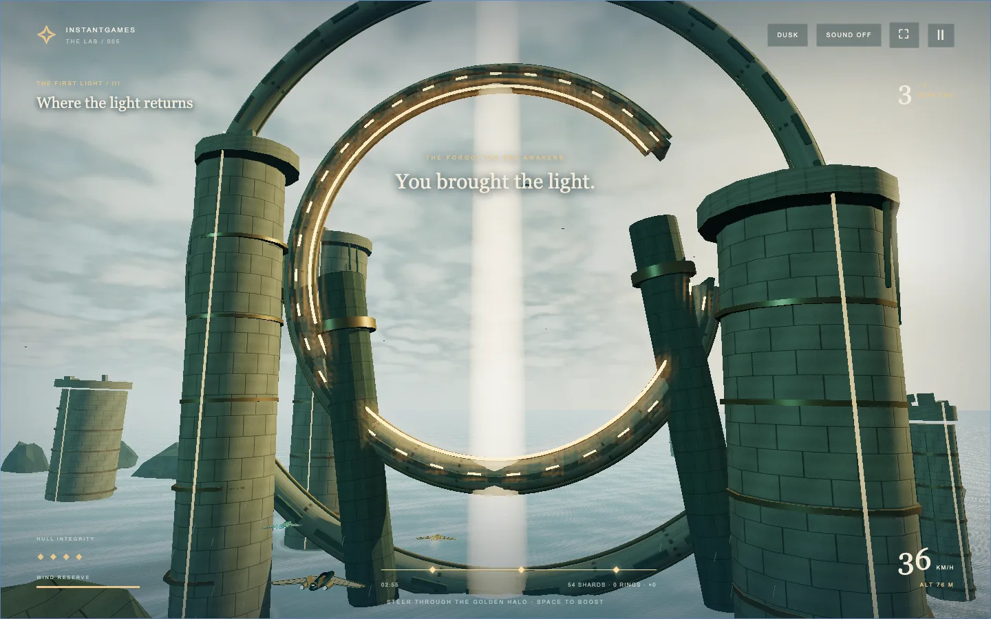
I preserved the awakening as a separate ending beat. After a journey full of steering corrections and warning markers, the monument needs a moment to be seen. The ten-second sequence before results is part of the reward, not dead space to remove simply because it contains no button press.
9. Treat the phone as a different composition
Phone support was not finished when the steering pad first appeared. The controls had to work simultaneously: drag with one finger, hold boost with another, and use combat buttons when an interception starts. Releasing a touch must release the action. Quick squad taps are queued so a tap between simulation steps is not lost.
Two layout bugs were especially instructive. The voyage chart could overflow because its grid content insisted on a wider minimum width. Separately, rotating from landscape back to portrait could leave the canvas holding a wide inline size. Those produced similar symptoms but required different fixes: constrain the chart’s layout, and let responsive CSS control the canvas’s display size.
The playable homepage also became the game’s information page. Instructions, FAQs, a home link, and related games live around the launch experience instead of behind a competing details URL. During flight, the guide is hidden. Before flight, the text has to remain readable and the buttons reachable on a narrow screen.
My browser checks cover 320-pixel and 390-pixel portrait widths, landscape, rotation, and simultaneous touch actions. They are browser simulations, not physical-phone certification. I would still want real-device sessions for heat, sustained frame rate, browser chrome, and how the controls feel under thumbs. A dev log should name that remaining gap rather than turn an emulated screenshot into a universal performance claim.
10. Use repeatable checks, then look at the result
The project exposes a text snapshot of game state and a way to advance the same simulation in controlled increments. The campaign checks steer with keyboard input; they do not assign a winning score or teleport directly to the ending. That makes a full voyage repeatable enough to catch regressions after changing collisions or combat.
I split checks by behaviour: a complete route, collision and warning timing, independent wingmate motion, touch combat, repeated interceptions, and interface changes. The interception checks include retry points for all nine campaign waves. The campaign check expects three completed waves and nine kills on each voyage, alongside its beacon objectives.
There is a trap here: a test that stops before reaching the warning cannot prove the warning works. Earlier collision verification ran into exactly that kind of incomplete evidence. I had to fix the test sequence and rerun it. Likewise, a passing screenshot of wave one does not establish that wave three resets correctly.
Automated state checks and image inspection answer different questions. State can confirm that the ship lost hull, a reward was consumed, or pause froze an enemy. Images reveal a clipped wingmate, an unreadable warning, or an aircraft that still looks like disconnected shapes. Neither replaces the other.
11. The page around the game is part of shipping it
Publishing exposed problems outside the flight code. A separate details URL complicated navigation and returned a 404 in the reported live visit. The simpler decision was to make the playable homepage the canonical place for the game and redirect the old details URL there. Players can read what the game is, learn the controls, and launch from one address.
The Lab card had a different failure: a nested link inside a card link caused the browser to split the intended card structure. The screenshot looked like an image card next to a text card. The fix was to restore a single card link. This is why checking source markup is not enough; the browser repairs invalid HTML, and the repaired page may not resemble the intended structure.
For another independent developer, the repeatable part of this project is the order of decisions: finish a short route; make the world’s collisions believable; add optional skill rewards; give companions distinct behaviour; build enemy arrivals as encounters; then check the page that gets people into the game. Each step produced something I could fly, break, and inspect.
Storm Courier is still a small browser flight game. Its strongest moments come from a few systems agreeing: the ruins look solid and behave solidly, the squad looks present and contributes, and an enemy wave has a reason to enter and leave the frame. That agreement took more iteration than the first attractive ocean scene.
Start with The First Light and watch the first patrol approach. That short transition is a useful place to judge whether the art, timing, warning, and controls are doing their jobs together.