Building Pixel Dungeon: Lessons From a Roguelite Dungeon Crawler Experiment
Procedural dungeon generation, enemy rendering bugs, camp UX nightmares, and the surprisingly tricky problem of canvas resolution — an honest account of building a 16×16 pixel art roguelite from scratch, and the hard lessons that came with it.
The Origin: Why Build Another Dungeon Crawler?
Every game developer's project backlog has at least one dungeon crawler in it. It's practically a rite of passage — the kind of project that sounds simple enough to finish in a weekend and inevitably expands into something much bigger. Mine started the same way.
I had Anokolisa's 16×16 pixel art tileset sitting on my hard drive, and a nagging curiosity: could a complete roguelite loop — procedural dungeons, combat with multiple enemy types, a camp system for crafting and upgrading, boss battles, loot drops — be built as a single-page HTML5 Canvas game with no build tools, no frameworks, just vanilla JavaScript?
Not as a tech demo. As a game someone would actually want to play for a few minutes.
It turns out, you can. But the path from "procedural dungeon generator works" to "players understand what they're looking at" is longer than you'd think. Much of what I learned had nothing to do with algorithms and everything to do with the gap between what developers see and what players experience.
Architecture: 6 JS Files, Zero Dependencies
When I look at some indie game projects, the dependency tree is more terrifying than any dungeon. I wanted to go the opposite direction — a codebase where you can open the HTML file directly from your file system and everything just works.
The final structure landed on 6 JavaScript modules, each with a clear responsibility:
Codebase Map
- index.html (~1000 lines) — The beating heart. Game loop, rendering, state management, player movement, camera system, input handling, and scene transitions. Everything ties together here.
- camp.js (325 lines) — The entire camp system: tile map layout, station definitions, tile rendering with warm wood floors and stone walls, portal effects, and station interaction logic.
- combat.js (400 lines) — Enemy AI states (patrol, chase, attack, hurt), damage calculations, hitbox detection, knockback physics, boss encounters, and loot drops.
- items.js (500 lines) — The item database, crafting recipes, equipment stats, potion effects, material drops, and loot table generation.
- ui.js (580 lines) — Inventory grid, crafting interface, tooltips, equipment slots, drag-and-drop, and notification toasts.
- audio.js (200 lines) — Procedural Web Audio synthesis for all sound effects and background music. Not a single .mp3 or .wav file in the project.
There's a seventh file — themes.js — that handles dungeon visual themes across different floor ranges. Forest, cave, ice, fire, shadow — each floor range gets its own palette of wall colors, floor tones, and ambient lighting. It's a small touch, but it's the kind of thing that keeps the game feeling fresh as you descend deeper.
Zero dependencies doesn't mean zero complexity. It means every line of complexity is yours to understand, and yours to fix when it breaks. That's a trade-off I consciously chose.
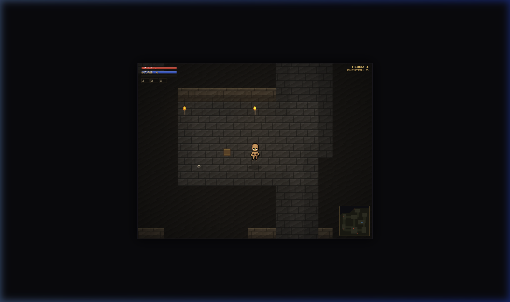
Procedural Dungeon Generation — The Foundation
The dungeon generator is the engine that keeps the game replayable. Every time you enter a new floor, the layout is different — different room sizes, different corridor connections, different enemy placements. Getting this right was both the most satisfying and the most bug-prone part of the entire project.
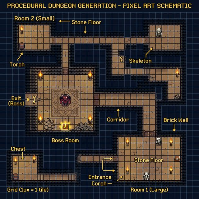
The Algorithm
I went with a room-first approach: scatter a bunch of rectangular rooms across the map, throw out any that overlap, then connect survivors with L-shaped corridors. It's not the most sophisticated method (BSP trees are fancier, cellular automata more organic), but it produces clean, readable dungeons that work well with top-down sprites.
function genFloor() {
  const sz = 40 + floor * 5;  // Map grows with depth
  dmap = Array(sz).fill(null).map(() => Array(sz).fill(0));
  rooms = [];

  // Place 6-12 rooms with random dimensions
  for (let i = 0; i < 6 + floor; i++) {
    const w = rand(5, 12), h = rand(5, 10);
    const x = rand(2, sz - w - 2), y = rand(2, sz - h - 2);
    if (!overlaps(rooms, x, y, w, h)) {
      carveRoom(x, y, w, h);
      rooms.push({ x, y, w, h });
    }
  }

  // Connect rooms with corridors
  for (let i = 1; i < rooms.length; i++) {
    carveCorridor(rooms[i-1], rooms[i]);
  }
}
Floor Scaling: The Difficulty Curve
One thing I learned early: procedural generation without intentional scaling feels flat. Floor 1 should feel different from Floor 5, not just in enemy count but in spatial complexity. Each floor increases the map size by 5 tiles, adds more rooms, spawns stronger enemies, and introduces boss encounters on milestone floors.
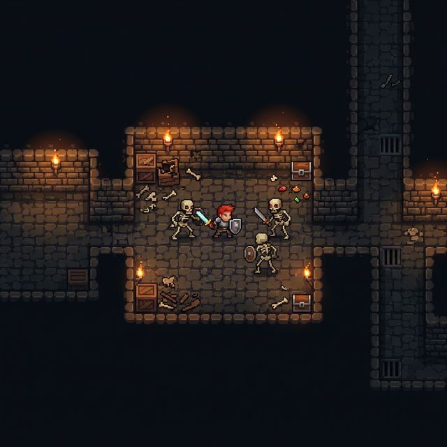
The enemy spawner uses the floor number to select from increasing tiers — slimes and rats on early floors, skeletons and dark knights in midgame, demons and shadow lords in deeper levels. Each enemy type has its own AI personality: slimes bounce in random patterns, skeletons patrol methodically, demons charge aggressively with fire attacks.
⚡ Lesson: Decoration is Game Design
Wall torches, floor cracks, scattered bones — these aren't just visual polish. They serve as landmarks that help players navigate procedurally generated spaces. Without them, every corridor looks the same and players get disoriented. A torch on the wall is secretly a navigation aid.
The Enemy Rendering Bug That Haunted Me
About a week into development, I ran into a bug that taught me more about game architecture than any tutorial ever could: enemies would become invisible when the player walked close to them.
Let me repeat that. The core gameplay mechanic — seeing enemies so you can fight them — broke when you tried to do the core gameplay activity — getting close to enemies to fight them.
If you're ever tempted to think rendering is simple because "you just draw things on screen," this bug is your reality check.
What Was Actually Happening
The drawEnemy function used conditional rendering based on enemy state. An enemy could be in several states: patrol, chase, attack, hurt, dead. The rendering code had different sprite selections for each state. But there was a gap — when an enemy transitioned from patrol to chase (which happens exactly when a player gets close), there were a few frames where the state variable was updated but the corresponding sprite hadn't been selected yet.
The result? For 2-3 frames, the enemy was being drawn with an undefined sprite reference. Canvas silently ignores drawImage calls with invalid sources. No error in the console. The enemy was there, it could still hit you, but it was invisible.
function drawEnemy(e) {
  // Always have a valid sprite, even during state transitions
  const sprite = ENEMY_SPRITES[e.type]?.[e.state]
    || ENEMY_SPRITES[e.type]?.['idle']
    || fallbackSprite;

  // Never pass undefined to drawImage
  if (sprite && sprite.complete) {
    ctx.drawImage(sprite, e.x, e.y, TS, TS);
  }
}
The fix was straightforward: chain fallbacks. If the current state doesn't have a sprite, fall back to idle. If idle doesn't exist, use a generic fallback. Those three lines of defensive code eliminated a bug that had been intermittently breaking the game for days.
⚡ Lesson: Canvas Fails Silently
Unlike DOM rendering where missing elements throw visible errors, Canvas drawImage with undefined or incomplete images simply does nothing. No error. No warning. The pixel stays whatever color it was before. This makes rendering bugs incredibly hard to spot without explicit defensive coding.
Camp UX: When Players Don't Know What To Do
This is the part of the story I find most instructive, because it's a problem I created for myself by thinking like a developer instead of a player.
After clearing Floor 1, players return to the camp — a safe haven with crafting stations, storage, and a portal to the next dungeon floor. I'd built a full camp system with 9 interactive stations: bonfire, workbench, anvil, furnace, alchemy table, cooking pot, storage chest, merchant, and the dungeon portal.
To me, this was obvious. There's a bonfire! Clearly you rest there. There's an anvil! Obviously that's for weapon upgrades. The portal with swirling energy? That's your way to the next floor, everybody knows that.
The first time I watched someone else play, they walked into camp and immediately asked: "What is this? What am I supposed to do here?"
The Root Problem
In a 16×16 pixel game, visual affordance is extremely limited. A bonfire is about 12 pixels of flickering orange on a dark brown background. An anvil is a gray blob next to a slightly different gray blob. Without context, these tiny sprites are just noise on a dark screen.
But the visual was only one of several problems I found. Here's the full list:
Camp UX Problems Identified
- No welcome message: Players had zero context about why they were in camp or what they could do there.
- Invisible labels: Station names only appeared when you walked right next to them. If you didn't walk over, you'd never know what they were.
- Too dark: The vignette effect (darkening edges for atmosphere) was tuned for dungeon combat, not camp exploration. Half the stations were hidden in shadow.
- No portal guidance: The dungeon entrance looked like any other station. Players didn't know it was the way forward.
- Auto-opening panels: The
returnToCamp()function was opening the cooking panel automatically, confusing players who didn't understand what they were looking at.
The Fix: Information Layering
I overhauled the camp in a single session, using what I now think of as information layering — presenting information at three distances:
Far away (screen-level): A banner at the top reads "⛺ BASE CAMP" with the instruction "Walk near stations & press E to interact." This gives instant context. Players know they're in a safe space, they know there are interactive stations, and they know the key binding.
Medium distance (across the room): Every station now displays a persistent label with its icon and name — "🔨 Workbench", "⚒ Anvil", "🔥 Bonfire". These are visible at all times, not just when you're standing on top of them. The font uses a dark shadow for contrast against varied backgrounds.
Close up (interaction range): When you're within interaction distance, a pulsing cyan border highlights the station, "Press [E]" appears in bright white, and a gray description explains what the station does: "Craft weapons and armor from materials."
Making the Portal Unmissable
The dungeon portal got special treatment. I enlarged the stone archway, added swirling energy particles inside the portal frame, displayed the floor number ("F1") glowing in the center, and placed a pulsing "▼ DUNGEON ▼" indicator below it. Nobody misses the dungeon entrance now.
The Lighting Fix
This was subtle but critical. The dungeon vignette — a radial gradient overlay that darkens edges for atmosphere — was set to rgba(0,0,0,0.55) in all scenes. For combat, that's actually good — it creates tension and makes torchlight feel meaningful. But in camp, it hid half the stations.
// Lighter vignette in camp for better visibility
const vigAlpha = scene === 'camp' ? 0.25 : 0.55;
const vg = ctx.createRadialGradient(
  cx, cy, W * 0.3, cx, cy, W * 0.7
);
vg.addColorStop(0, 'rgba(0,0,0,0)');
vg.addColorStop(1, `rgba(0,0,0,${vigAlpha})`);

// Warmer ambient glow in camp
const warmAlpha = scene === 'camp' ? 0.08 : 0.04;
// Creates a cozy, safe feeling
I also bumped the floor tile base color from rgb(68+v) to rgb(95+v) and increased the warm highlight overlay. The camp now feels distinctly brighter and warmer than the dungeon — which is exactly right. Camp should feel safe. The dungeon should feel oppressive. Same rendering engine, different emotional tone, just by adjusting a few color values.
⚡ Lesson: Developer Blindness Is Real
If you built it, you already know what everything does. That knowledge makes you literally unable to see your own UI problems. The moment someone else looks at your game and says "what am I supposed to do here?" — that's the most valuable feedback you'll get in the entire project. Don't argue with it. Fix it.
The Canvas Resolution Problem Nobody Warns You About
Here's a mistake I see in almost every HTML5 Canvas game tutorial: they set the canvas size to window.innerWidth and window.innerHeight. Every frame. Sounds reasonable, right? The game fills the screen, it's responsive, what's not to like?
For most games, it's fine. For pixel art? It's a disaster.
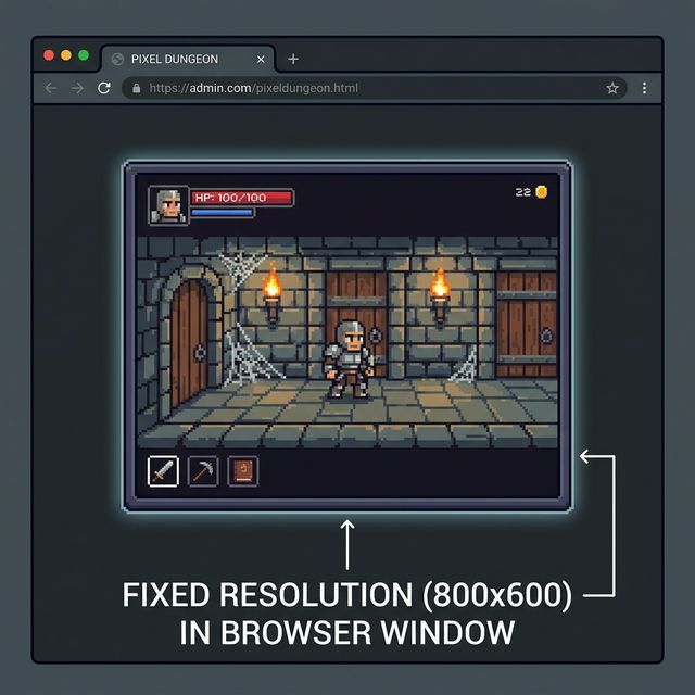
Why Full-Screen Canvas Breaks Pixel Art
Pixel art depends on integer scaling. A 16×16 sprite should be rendered at 16px, 32px, 48px, or 64px — whole number multiples. When your canvas is 1920×1080 pixels and your tile size is 16, that works out to 120 tiles across, which is fine. But resize the window to 1753×986, and now each tile is 16 pixels but the canvas is an odd width. The camera offset becomes a fractional pixel. Sprites subtly jitter between pixel alignments. Some pixels appear wider than others.
It's the kind of visual artifact that feels "wrong" even if players can't articulate what's happening. The sprite edges shimmer. The grid doesn't align. It feels cheap.
The Fix: Fixed Internal Resolution
const GAME_W = 800, GAME_H = 600;

function render() {
  // Set canvas once, not every frame
  if (C.width !== GAME_W || C.height !== GAME_H) {
    C.width = GAME_W;
    C.height = GAME_H;
  }
  // ...
}

// CSS handles scaling
#game-container {
  width: 800px; height: 600px;
  max-width: 100vw; max-height: 100vh;
}
canvas#game {
  width: 100%; height: 100%;
  image-rendering: pixelated;
}
The solution is to separate internal resolution from display size. The canvas always renders at 800×600 pixels internally. CSS scales it to fit the browser window. The image-rendering: pixelated property ensures the browser uses nearest-neighbor scaling instead of bilinear interpolation, so pixels stay sharp even when scaled up.
The Mouse Coordinate Trap
But there's a subtle follow-up problem that tutorials never mention: when the CSS display size differs from the Canvas internal size, mouse coordinates break.
event.offsetX gives you the position relative to the CSS element, not the internal canvas. If your canvas is 800×600 internally but displayed at 1200×900 on screen, clicking at CSS position (600, 450) maps to canvas position (400, 300). Every click-based UI — inventory management, crafting recipes, equipment slots — gets silently broken.
function canvasCoords(e) {
  const r = C.getBoundingClientRect();
  return {
    x: (e.clientX - r.left) * (GAME_W / r.width),
    y: (e.clientY - r.top) * (GAME_H / r.height)
  };
}

// All mouse handlers use mapped coordinates
canvas.addEventListener('click', e => {
  const { x, y } = canvasCoords(e);
  handleInventoryClick(x, y);
});
The fix is to always compute coordinates through getBoundingClientRect() and scale them by the ratio of internal size to display size. This mapping function needs to be applied everywhere — mousemove, click, contextmenu, touchstart. Miss one handler and you get an inventory panel where the top-left corner works but the bottom-right doesn't.
The Container Pattern
One more gotcha: overlay elements. If your HUD, minimap, and menus use position: fixed, they anchor to the browser window, not the game canvas. When the canvas is centered with dark borders around it, your HUD floats off in the corner of the browser while the game sits in the middle.
The solution is a container div: wrap the canvas and all overlay elements in a #game-container with position: relative, then change overlays from position: fixed to position: absolute. Everything stays within the game's visual boundary.
⚡ Lesson: Pixel Art Demands Integer Precision
In pixel art games, "close enough" is never close enough. A single fractional pixel offset creates visible jitter. A scaling ratio that's 99.5% correct still produces artifacts. Use fixed internal resolution, integer camera positions, and explicit coordinate mapping. It's more work upfront, but it eliminates an entire category of visual bugs.
6 Hard Lessons From Pixel Game Development
After all the coding, debugging, and playtesting, here's what I'd write on a sticky note and put above my monitor for the next project.
1. Tile Caching Changes Everything
Early builds were re-drawing every tile every frame. On a 40×40 map, that's 1,600 fillRect calls per frame plus decoration. Moving to an off-screen canvas tile cache — rendering the entire map once, then blitting it as a single drawImage — dropped per-frame draw calls from 2,000+ to under 200. On mobile browsers, this was the difference between playable and slideshow.
2. Audio Can Be 100% Procedural
The entire sound design — footsteps, sword slashes, enemy hits, level-up chimes, background music — is synthesized using the Web Audio API. No audio files at all. A sword attack is a filtered noise burst. A healing potion is an ascending arpeggio. The dungeon background music is a looping pattern of square-wave notes in minor pentatonic.
The advantage isn't just smaller file size — it's that every sound can be dynamically tuned. Boss hits sound deeper. Critical hits add a frequency sweep. The camp background music is warmer by shifting the filter slightly. Sound becomes data, not assets.
3. State Transitions Hide Rendering Bugs
The enemy invisibility bug wasn't in the "patrol" code or the "chase" code. It was in the 100-millisecond gap between them. Most rendering bugs live in transitions, not steady states. When debugging visual glitches, always check what happens during state changes, scene transitions, and the first frame of animation playback.
4. "Obvious" UI is Never Obvious
If your UI doesn't explicitly tell players what's happening, they won't figure it out. Labels are not optional. Tooltips are not a nice-to-have. Welcome messages are not hand-holding. When your entire game world is rendered in 16×16 pixel tiles, every icon is ambiguous. Text is clarity.
5. Atmosphere is Math
The difference between "dark and moody" and "I can't see anything" is literally one float value in a radial gradient. The difference between "warm and cozy camp" and "boring brown room" is a +27 bump to the RGB base value and a slightly larger warm-light overlay. Atmosphere isn't a vague artistic quality — it's concrete numerical choices in your rendering pipeline.
6. Test on Someone Who Didn't Build It
This bears repeating because it's the lesson that actually changed the game the most. Every single UX improvement in the camp system came from watching someone else play. The developer's curse is that you already know the answer to "what does this do?" — so you literally cannot evaluate whether the question needs to be answered in the UI.
What's Next
Pixel Dungeon Crawler is still in the Lab — it's experimental, iterative, and very much alive. The foundation is solid now: procedural dungeons work, combat feels responsive, the camp system makes sense to new players, and the fixed-resolution canvas renders correctly on everything from high-DPI laptops to old office monitors.
What's on the roadmap:
- More enemy variety with unique attack patterns (ranged enemies, summoners)
- Equipment system with visual changes on the player character
- Floor-specific environmental hazards (lava tiles, poison clouds, spike traps)
- Save/load system using localStorage
- Achievement system to reward exploration
If you want to try it now, the game is playable at instantgames.top/lab/pixel-crawler. The source is vanilla JavaScript — no build step, no dependencies. Open the file, open the console, and break things. That's how games get better.
Thanks for reading. If you're building something similar, I'd love to hear about it.